I want to practice PR at Third Man Records one day. What I also would really love to do is design things for them whether it’s a poster or album, letterhead or business card, whatever. Therefore I decided to start designing my own Jack White posters to exercise my creative muscle. This is the first one.
Alone
This is a poster I designed for my friend Chiko Chingaya’s upcoming short film “Alone.” All photography and design are by me.
No Man is Ever Alone on the Sea.
Assignment-typeface poster.
For this assignment we had to pick a font and design a poster that reflected said font. I didn’t really branch out for this assignment, but looking back I wish I had. The font I used was Baskerville, and I found this lovely photo and quoted Ernest Hemingway’s “The Old Man and the Sea” because I found the quote and text to be both timeless.
Graveyard Shift Energy pt 2.
Assignment-corporate identity.
We had to design a corporate identity for a self-made up energy drink company. My boyfriend and I were driving really late from Tennessee back to Oklahoma and I thought “Man, we’re on the graveyard shift tonight,” and BOOM! Graveyard Shift Energy was born. This is the front and back of the business card.
Graveyard Shift Energy.
Assignment-corporate identity.
We had to design a corporate identity for a self-made up energy drink company. My boyfriend and I were driving really late from Tennessee back to Oklahoma and I thought “Man, we’re on the graveyard shift tonight,” and BOOM! Graveyard Shift Energy was born. This is the letterhead.
Tibet House.
Assignment: event poster.
I chose to do the benefit concert that supports Tibetan culture, sponsored by the Tibet House. I chose to go with a red/white color scheme because 1) it is a classic eye catching color scheme and 2) red symbolizes preservation and white symbolizes purity in Tibetan culture. I used the buddhist Wisdom Eyes to draw in the viewer as well as to further promote Tibet and it’s livelihood because Buddhism is the main religion there.
Deap Vally.
Assignment: album cover.
For this assignment we were supposed to select one song from an artist and design album artwork that encompasses the energy of that song. I chose “Baby I Call Hell” by LA duo Deap Vally. The chorus sings, “What you call love, baby, I call hell.” So I placed this picture of the girls inside of a fiery heart. I loved the way their body language mimicked the shape of the heart.
Click the photo to watch the music video!
Invisible Monsters.
Assignment: redesigned book cover
I chose Chuck Palahniuk’s “Invisible Monsters.” I took a photo of my stunning friend Dorothy and put a silhouette of Medusa behind her to represent the idea that you may be beautiful on the surface but there could be a monster underneath–an idea the novel plays with.
Progress
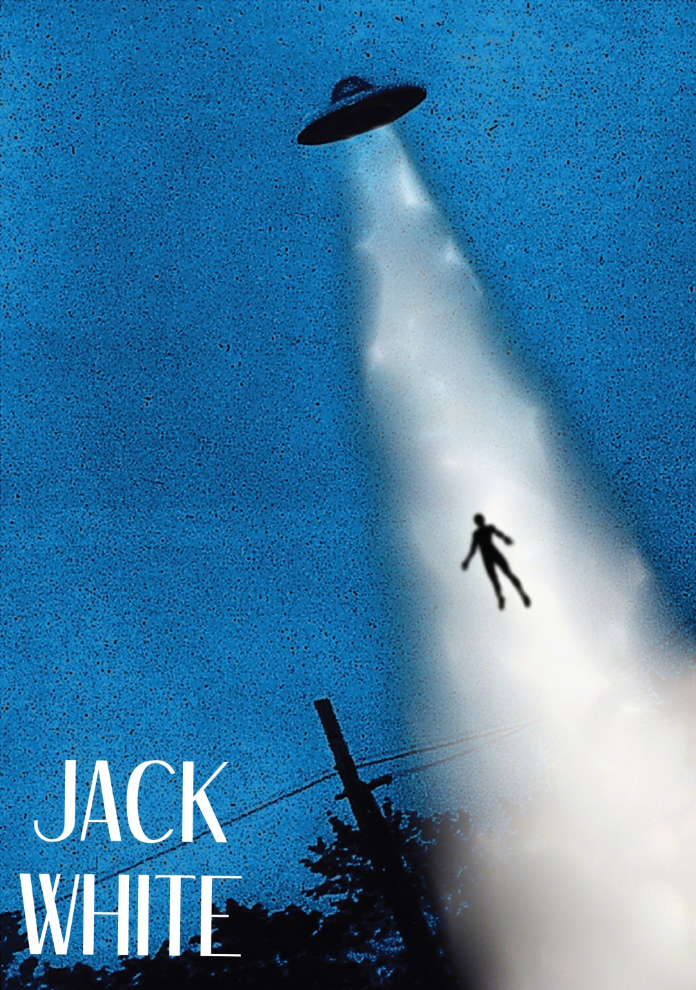
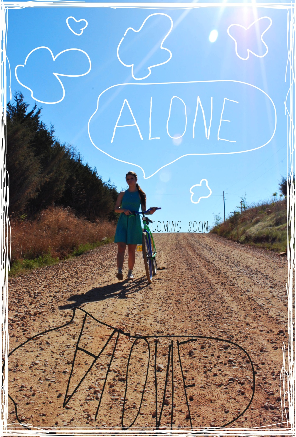
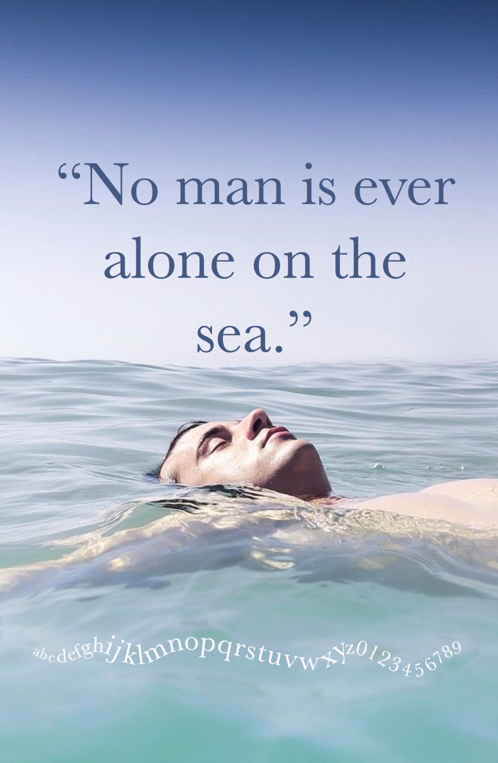
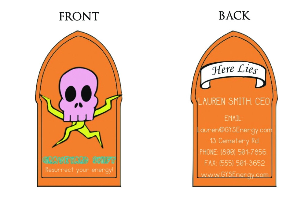
This semester I’ve been taking a Graphic Design class tailored for people who are studying PR/Advertisement. I have learned SO MUCH and have created things like posters, album covers, book covers, and more. I can honestly say I’ve fallen in love with Graphic Design!
I’m eager to post my work but I am fighting my urge to jump the gun and will wait. Because I first have to perfect these projects for my portfolio (this blog!) and I know they will be much better by the time I do.
This post isn’t a requirement in any of my classes but I wanted to let those who would consider me for an Internship or employment that I love what I do. I’m so excited to share my progress with you all!
-Lauren